Article category
As a reminder of Ettore Sottsass's passing a little more than 2 years ago now, here is a quote I found in an exhibition catalog about Martine Bedin's work (she was part of the Memphis group). Sure, design is about considering the needs of the users, helping them to accomplish tasks in a comfortable way, but it's also speaking to their senses, their emotions, their aspirations in life and helping them to feel proud of the way they spend it. There is so much to read about usability these days, and so little about the emotional aspects of design.
"If we enter a large, high-ceilinged hall, the secret state of our lives changes; as it changes as we enter a very small, low-ceilinged room, and as it changes if we enter a cloister with a fountain, palm trees and rose bushes. But it also changes if we find ourselves faced with an obscure piece of furniture made up of numerous drawers whose content we do not know; and it changes, too, if there is a painting of the Madonna on the wardrobe doors, or if the wardrobe is made of plain white plastic laminate.
The presence of design changes the more or less secret, more or less bearable subject of existence."
Foreword of "Prova d'autore", Martine Bedin
Translated from italian by Jonathan Hurt
Musée des Arts Décoratifs de Bordeaux, 2003
Apologies to you, english reader. This article is about a french website you have to use if you want to book train tickets online, and points out the webdesign-related reasons why so many people get frustrated using it. I won’t write this one in english for now, as I'm having a busy time, but you could try Google translate. Sorry !
Définir le métier de webdesigner à des personnes étrangères à cette industrie est une entreprise hasardeuse pour celui qui s'y lance. Graphisme, typographie, communication, sémiologie, syntaxes informatiques et autres activités s'y invitent, rendant les contours de cette association de compétences bien difficiles à cerner. La maudite question m'a été posée récemment et la discussion qui s'en est suivie n'a pas réussi à dissiper les brumes baignant le webdesign dans la tête des deux-trois curieux. Jusqu'à l'évocation d'un site en particulier : voyages-sncf.com. Voilà un site que la plupart des Français en âge de commander un billet de train ont pu utiliser, et qui visiblement ne laisse personne indifférent. Certes, râler est chez nous un sport national, mais les souvenirs laissés par ce site ne sont pas pour ainsi dire plaisants. Ce fût cependant un terrain connu très approprié à l'explication de mes occupations professionnelles.
✍ updated at the end, January 21st
As anyone who's interested in Apple products and interface design, I came across a lot of views, wishes and predictions about the new forthcoming Apple product known for now as the tablet.
But I didn't see any mention of handwriting recognition as a feature, even to argue why it wouldn't be an option. It's just as if the "who wants a stylus ?" from the iPhone intro had wiped the idea all along. For a device that has been designed to be operated with a single hand, it makes perfect sense. For a bigger one you'd need both hands: one to hold it, one to interact with the touch screen. The idea of a stylus as an input device (along with the multitouch input) does seem less out of context, as far as ergonomics go.
In short : Amazon acknowledges it had a light industrial design vision and sadly does not do better this time. Ergonomics get better, but seem to be improvable. Read Tschichold if you want to design a book, be it a digital one.
ℱ version française.
This post is a comment to the Stevens Creek TripLog/1040 UI design discussion happening on John Gruber's Flickr entry and Ryan Singer's SVN entry.
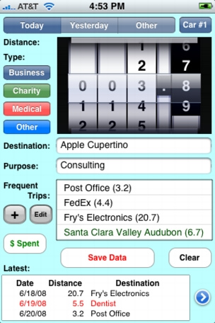
The first thought I had about this iPhone app's screenshot was, as many : "hammer, please".
But it's not pure villainy, just excessive sensitivity, and there are some logical facts backing this gut feeling, one of them being : this design mixes 2D and 3D features without any meaningful intentions regarding this dichotomy. It even seems to have no understanding of this dichotomy at all, which is even worse. But the beautiful thing about a mess is that you can only do better. Here are some comments which will hopefully help in this sense.
Pretty much every OSX and Apple apps UIs share this common analogy : they don't display a rendering of a flat, 2D, printed surface, but it shows an arrangement of items that can be described with height, material and texture proprieties. All these simulated 3D objects react to a single (or a single set of) light source, consistently from one screen to another. Every Apple designed iPhone app lives under a softbox giving this fat glossy reflection on top of the iTunes/AppStore/Sms/... buttons, and a more diffuse gradient on top of the Notes button, for example. You can visit every apps on your mac and imagine how it would look like if you turned these lights off. Not that it would turn you on, but it goes a long way to express how consistent the MacOSX UI is.
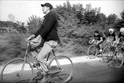
Going for a coffee this afternoon, I saw a fancy cyclist standing still on his two wheels only, waiting for his turn at the red light. He stood like this, without moving an inch for a good 30 seconds : well done, champ.
This had me thinking that in fact, being able to gain equilibrium on two turning wheels is quite striking, as mundane as it can be for us today. On our dear western society technological achievements timeline, the appearance of the bicycle* is oddly late, compared to tremendously more complex concepts that came to us before that.
See, the men who knew there was hydrogen in the sun (Angström, 1861), knew the speed of light (Foucault, 1850), communicated through a telegraph (Morse, 1844), understood the gravity phenomenon (Newton, 1687) and who were 5 years close to discover the automobile didn't know what it was to pedal and move forward at the same time.
Imagine the confusion and awe in Voltaire's or Benjamin Franklin's mind if they had been overtook by a bike while on their morning walk.
* the one with a chain drive, introduced around 1880, not the crotch-cruncher known as the Draisine that appeared in 1818.
Movie still : Jour de fête by Jacques Tati.
Until thought control becomes accurate enough, physical interfaces will remain necessary to interact with video games. Consequently, these products can and should be considered as tangible objects, or more accurately, products experienced physically. The first contact one has with a video game is in fact with the controller of the platform it is played on.
This past year, casual gaming has had a huge boost in consumption while alternative controllers such as the Wiimote and Rock Band game accessories have attracted numerous gamers, novice and seasoned alike.
Would it be too adventurous to state that these two events are linked, that these new ways of controlling games (read : new ways of experiencing a video game product) have brought some much needed fresh air in this industry ? You'll see for yourself, but I assume it's the case. Details on their way, followed by some projections on the role multi-touch interfaces could play in casual gaming.